Do you have a grand majestic foyer, big enough for a round center table? A medium sized foyer big enough for something but not sure what. Or are you like me, in a split entry, with stairs going both up and down, a 42×80″ slab and a 12′ ceiling that joins the living rooms 8′ ceiling when you get upstairs? Read along while I provide suggestions about designing for awkward foyers.
When we first moved into this house so many years ago, I didn’t have a clue of what to do about this space. It’s so small that two people can’t stand in the entry without committing a sin. Opening the door to let guests in is a logistical nightmare. You have to move yourself up a step to accommodate them. Luckily, we don’t use this entrance at all except of course when we have company, and to retrieve packages from the small front stoop. No it’s not a porch. It’s just a stoop! But we walk thru this akward foyer many times a day.
Early on, I realized I had a big piece of real estate above the front door, and a huge 12′ tall wall that stood blank for a very long time. It probably stands blank in many awkward foyers. My imagination finally lead me to the right place, and I eventually figured out that the awkward space over the door could use a picture. That helped to bring that space into the living room and make the small room feel more expansive. Then there was the 42″x12′ wall, which was screaming for something too. But what? I couldn’t just put a large picture there next to a large picture on the perpendicular wall. I knew that wasn’t going to work well.
THE SOLUTION
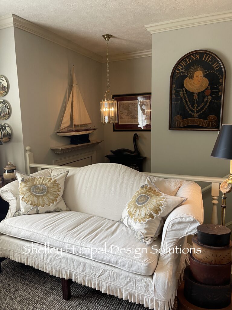
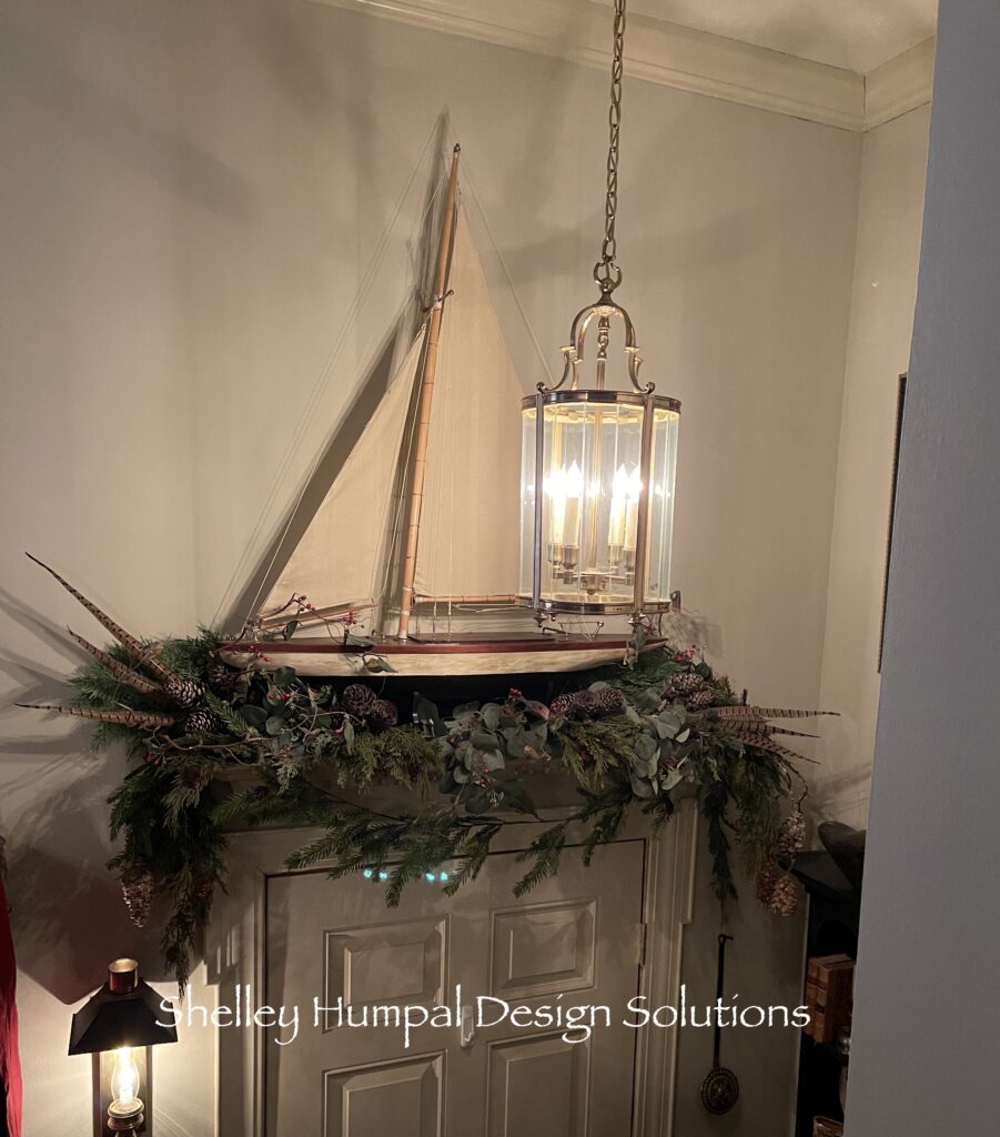
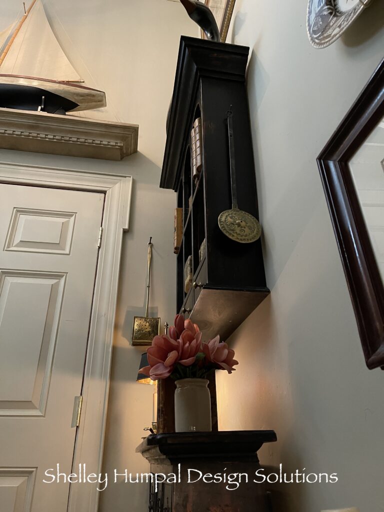
Never satisfied I kept looking for a better solution. Then one day it occurred to me that if I had something sculptural over the door the map picture hanging oh so high to the right would make more sense. But what could it be? A trip to Maine in 2000 gave me a clear path. Maine is all about pond sailors. Well of course Maine is boats in general. My dad loved to build pond sailors (model ships). While in Maine we bought a pond sailor for the spot over the door. A shelf was built and that ship filled that space beautifully. That sailor has since been replaced by one built by my dad. The map print I had on the perpendicular wall all of a sudden started to make sense. These two spaces started to become a happy part of the living room.
But what about the entry itself, you know the landing! It was still very lack luster. After all what can be done with such a tiny footprint – awkward foyers like this are so challenging? I found a three tier wall shelf while working at Ethan Allen that was perfect for the wall space behind the door. It didn’t inhibit the floor space and brought some interest to that extraordinarily tall wall space, and helped to balance the map print that was hanging very high. Now things were acceptable.

THE STAIRS
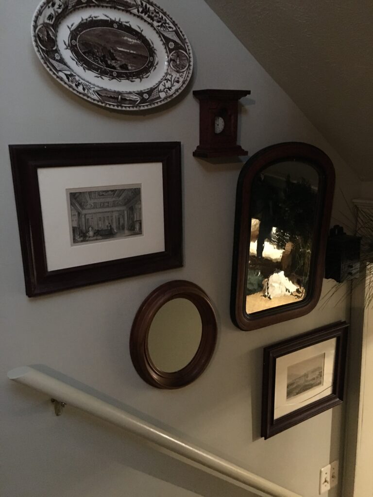
I then had the idea to do a wall arrangement of antique mirrors and smalls going down the basement stairs. Having a few smalls that I loved, I didn’t have a place for them, so I hung them here. An antique transferware fish platter and a couple of framed engravings round out the display and create some interest in a nothing walk by space.
Fast forward to 2019. I have lost my mom and brought home an apothecary chest built by my dad. It was a love letter to my mom and he had carved their initials into it with a heart. This piece was in their awkward foyers behind their front door along with a two tier wall shelf he also built to go with it. When I brought them home, I had no idea where they would go or how I would use them. For a few months they collected dust.
RENOVATION
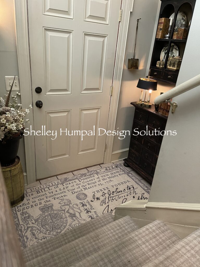
The husband and I began doing some renovations on our own home replacing flooring etc. Wanting something interesting on the stairs, after all they are the first thing you see when you enter our home, I chose a very subtle neutral plaid which was a great piece of carpet, and worth the investment.
THE WALL SHELF
Then it was time to test the apothecary chest, never in a million years did I think it could work. Next up, the wall shelf and all of a sudden this space began to take shape.
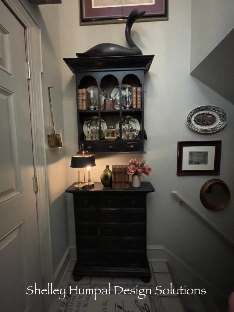
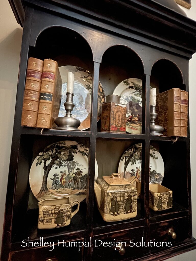
In the wall shelf is a small collection of antique Royal Doulton dishes from the Series Ware period called, “The Gleaners and Gypsies“. I simply love the colors and subject of them. Each one seems like a small painting.
The Stuff
I added in an antique Doulton Tea Set, pewter candlesticks and old leather books along with an antique tin with its original paper label which is Chinese. For some reason this just works well on these shelves. My dads black swan on the top, bridges the gap between the shelf and the map picture above. The brass wall sconce has been there forever and adding the small light on the apothecary balances some light down low. A brass chestnut roaster balances the other side of the door and a salesman sample of a brass bedwarmer creates a bit of interest as you’re coming up the stairs on the end of the wall shelf.
THE FLOORING
I hated the 8″ square tile on the floor for a long time. It will get replaced eventually but, a few months ago I placed a minimum order with Spicher and Company Vinyl Floor Cloths. Finding them at Highpoint Market in North Carolina many years ago, these rugs not only have a historic folk art vibe that appeals to me but, they also carry great rugs for a modern home. Their rugs work so well if you want a pop of pattern under a dining table, or a sun porch, bathroom or kitchen but, don’t want to worry about spills, wet footprints or muddy paws. I’ll do a post on them soon.
I found the perfect rug for this very small entry. It is a copy of a 17th Century New Jersey Three Pound Note. I just thought it was fun and liked the script against the plaid carpet. Unfortunately, I had to trim the border to make the rug fit but it was easy to do. I love this rug! It allows my door to open and close. I couldn’t use a traditional rug because the door always got hung up. If you’re in the market, I can now order these rugs for clients – just FYI.
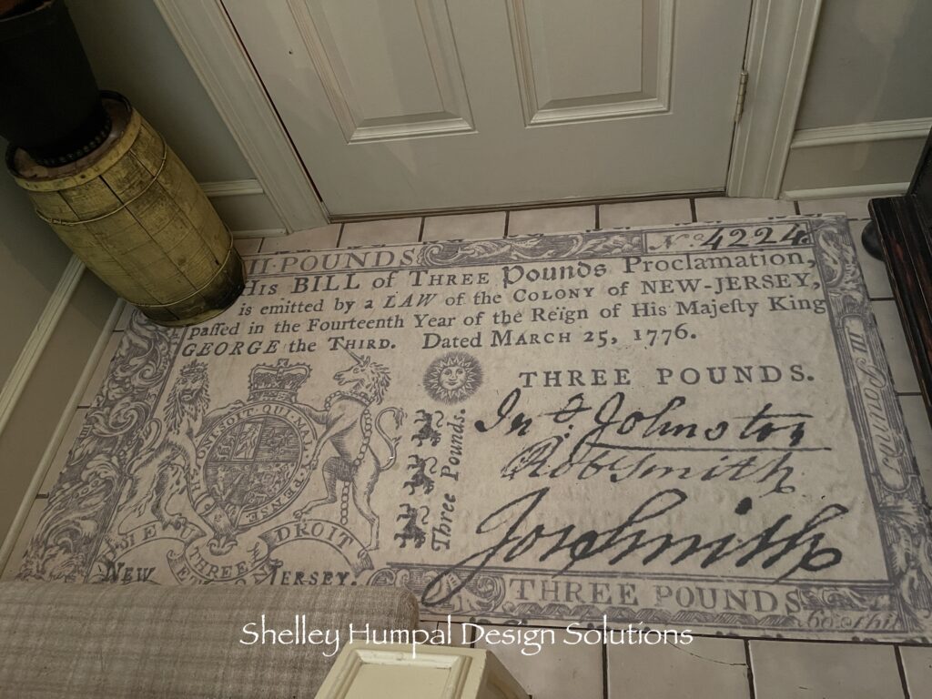
I then added a small yellow wooden barrel in the corner and placed a black leather fire bucket on top of it. Adding a neutral floral arrangement rounds out this tiny space.
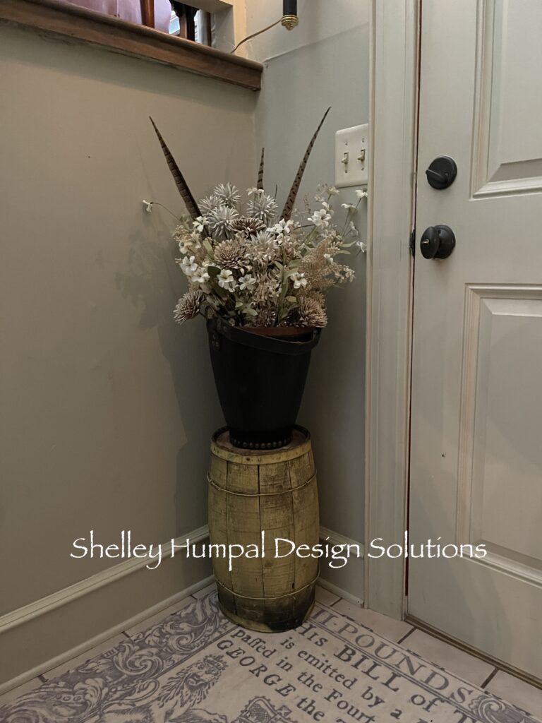
It has taken me years to be completely content with this 23s/f space. But now it works. It is visually appealing, as balanced as it can be, and filled with things I love. What this tiny space has done to balance out the living room and make it live a little larger is priceless.

I encourage you to look at your spaces with fresh eyes and see what you can come up with. Even if it doesn’t work, it may lead you to the right solution. This is now one of my favorite spaces to transform for the holidays. Read more about that here. Do you have awkward foyers or weird spaces with design challenges? I’d love to hear about it in the comments.
Thanks for stopping
Shelley
