Accessorizing for the “Normal” Size Home
Not everyone has a huge home with 10-12’ ceilings or lofty 20’ tall great room. I am the master of working with smalls.
There are all kinds of collectors.
- Those who collect the flavor of the moment
- Those who collect for collecting sake and then dump it for the new and improved collection
- Those who inherit and don’t have a clue what to do with this stuff they’ve just acquired
- Those who just don’t know when to say when
- Those who are passionate about the things they collect & study what they collect. These are the satisfied collectors.
Whether you are the first type or the last, it is important to know how to incorporate accessories into your home.
When working with small accessories you must have a way of corralling them, otherwise they become clutter. Think of accessories as an opportunity to create a painting with 3 dimensional objects: A still life for today’s living.
In this open concept society, we have put all the emphasis on the architecture of the home and diminished the importance of furnishing the home. Every room needs a focal point so you have an opportunity to express your own personal style.
Investing in a cabinet of some sort is helpful when working with smalls. This can be an antique or vintage find, a retro piece or a bunch of crates mounted to a wall. A sleek new bookcase or picture rails w/o pictures; who’d of thought!

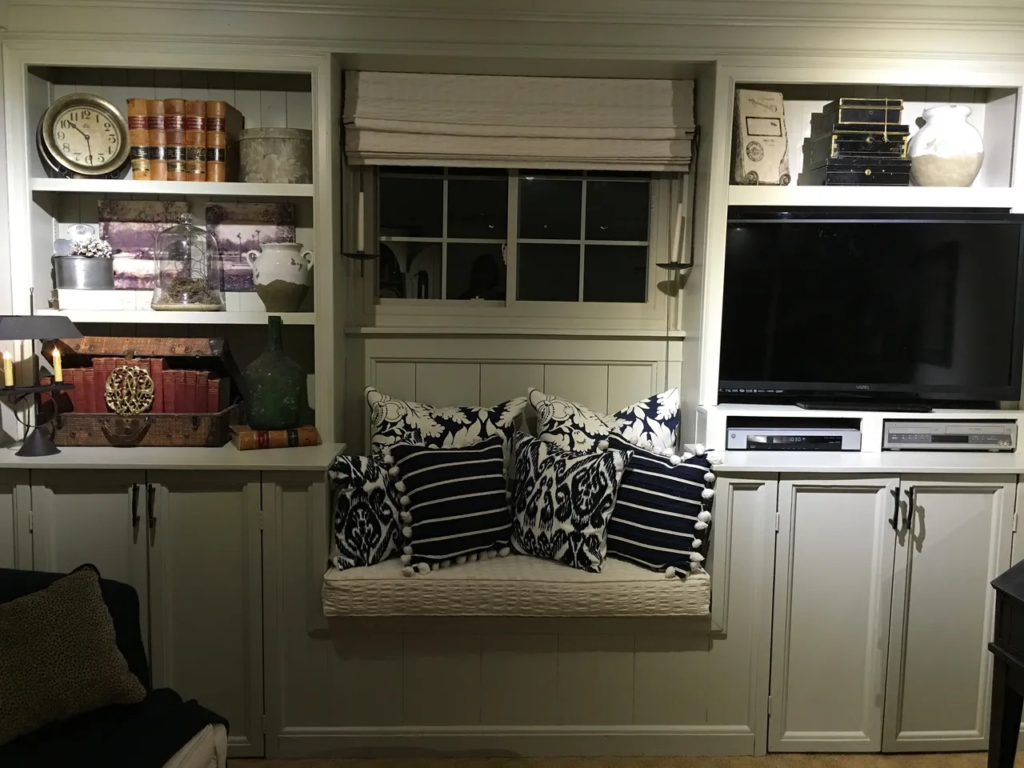
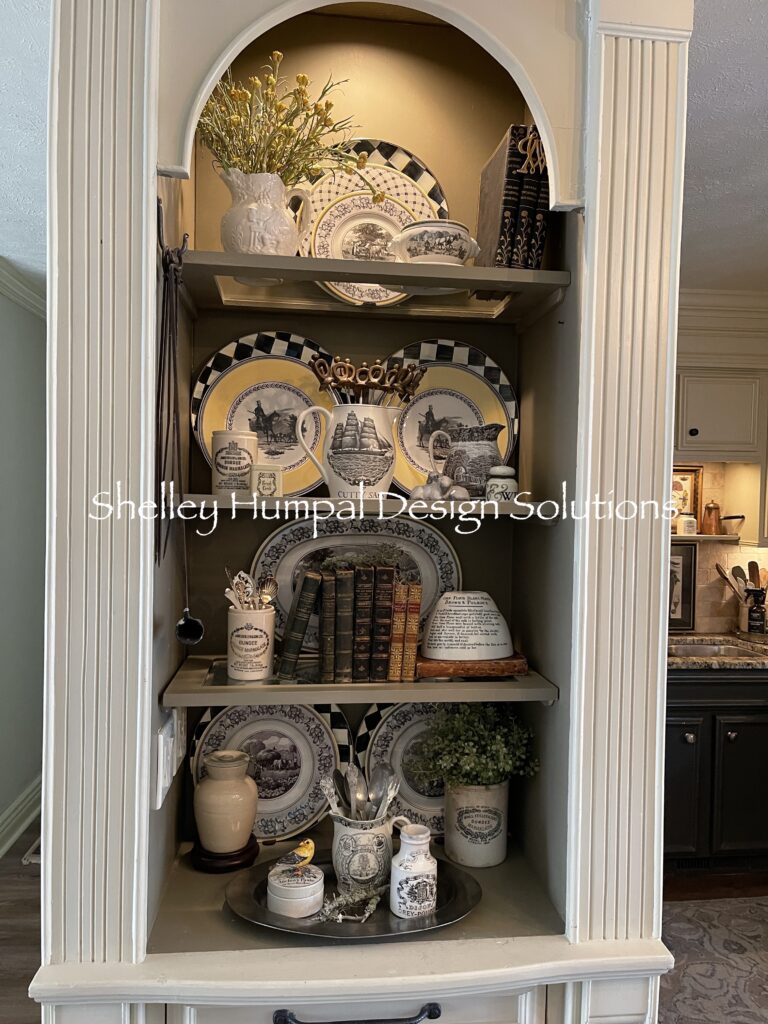
The depth of the shelves should be considered when selecting your accessories. The shelves dictate the size and scale of the objects you use. A built in bookcase will require larger items to support it then a cupboard with 6” shelves. A teacup will become lost in a built in book case, but will play nicely on a 6” shelf.
These are my tried and true rules.
Buy what speaks to you
- Odd numbers are better then even
- Layering your textures and vary the objects
- Every vignette requires a backdrop and an anchor
- Isolate your space
I rarely make a purchase that doesn’t speak to me. If it doesn’t speak to me why buy it?
Think in odd numbers. It doesn’t matter whether you are designing a gallery wall, table vignette or cabinets. Odd numbers; why do you think they (whoever they are) created the Five Piece Place Setting!
Layering your texture keeps the eye traveling across the cabinet. This should be your goal. A good composition will keep the viewer engaged and wanting to see more.
Backdrop and Anchor can be the same thing. This can be pretty much anything that is large and flat, from platters, chargers, game boards, or just a nice piece of art propped against the wall or cabinet. The anchor defines the space in front of it and helps to isolate that part of the composition.
My favorite space isolators are books. I have collected antique books for years, and I use them for all sorts of things. The books can make an object more important by “anchoring” it to the vignette. They have become pedestals, steps, walls and focal points.
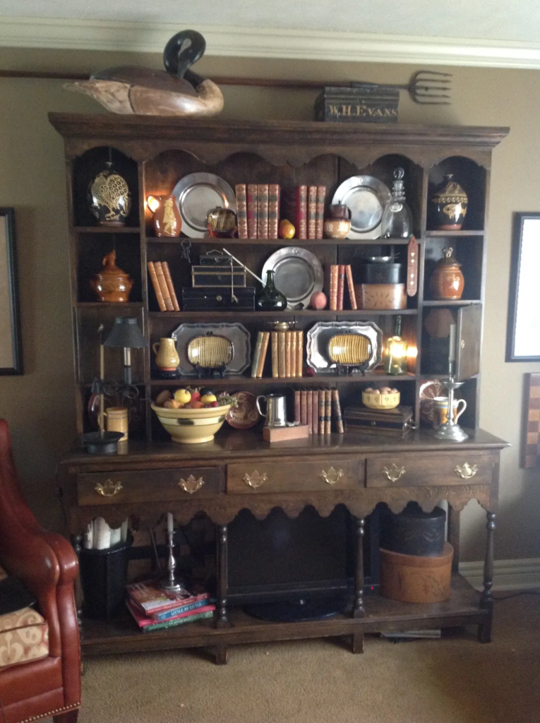
My Welsh Cupboard is a piece my dad built for me years ago. It has seen so many metamorophosis, It is always a fun one to change out.

Right now it is packed with over 100 objects. Sounds like a lot? Well yeah, it is but successful I think. It currently houses my collection of reproduction redware, toleware, a small collection of Doulton Lambeth pub ware, some yellow ware, Pewter and of course leather bound antique books. This cupboard is now such a hodge podge of different items that speak to me. It is a success because of it’s diversity. The collections surrounding the redware keep it from becoming to precious. From a few dollars to a few hundred dollars these objects coexist cheek by jowl in happy harmony.
Just the right amount of too much!
Thanks for stopping
Shelley
