Part II – No Demo Great Room Reno
This is part two of my three-part “NO DEMO” series. If you missed part one, The No Demo Kitchen Reno, you can catch up here.
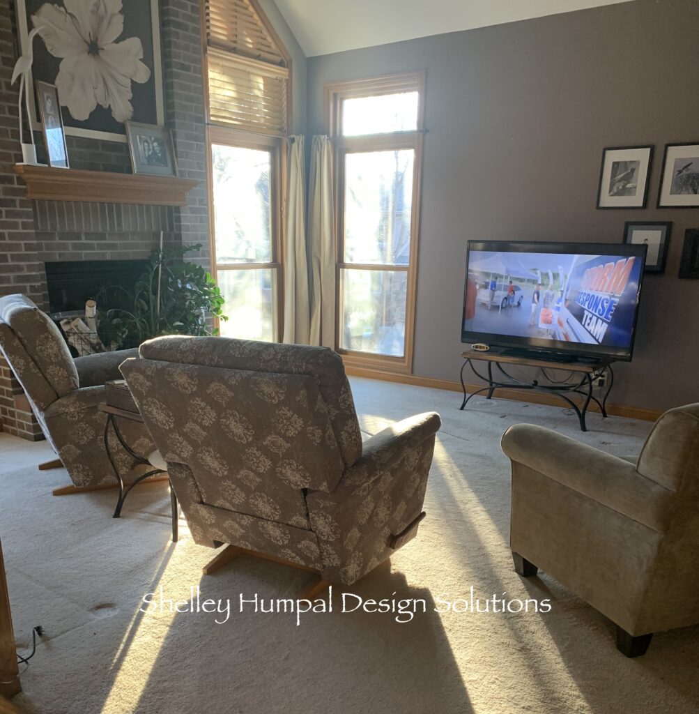
When I first walked into the great room, I was confused with the layout. They had big recliners directly in front of the fireplace with a large TV crammed in the corner by the staircase because of the cable connection. A smaller sofa occupied the largest wall in the room. There was another console in a different furniture style than everything else tucked in another corner. Comfortable for him, but not good for conversation or entertaining. It was important to me to make sense of this room, even if it was no demo and I had to work with all the existing furniture. I could see that it could be so much more.
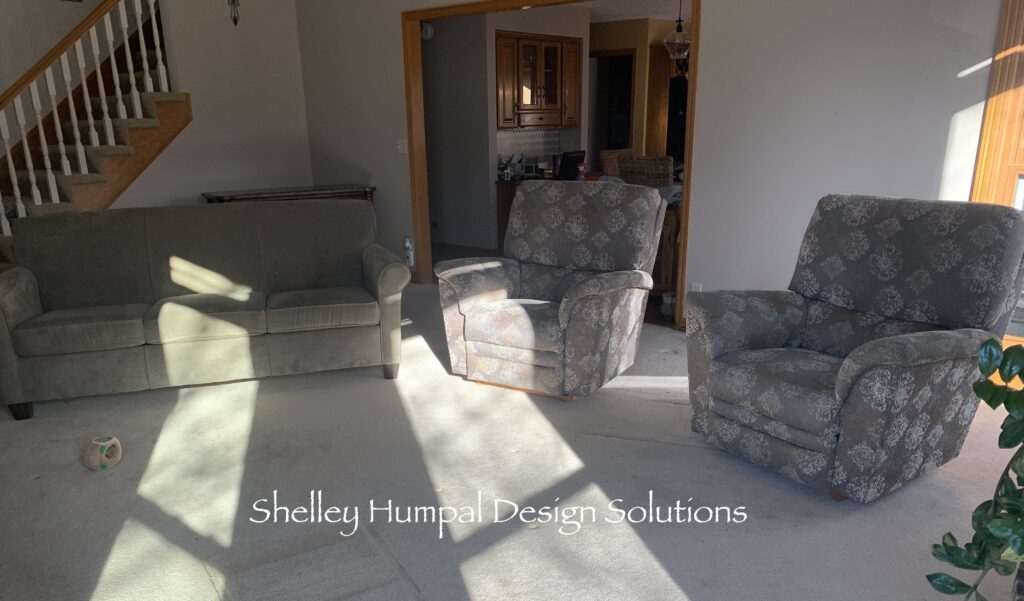
I was trying to figure out why the furniture was arranged the way it was. the response was, the cable is there. How often do we buy into something we know is wrong just because it is a bit inconvenient to fix the problem? I know, I have done it too. I suggested that the TV was in the wrong spot, and that it needed to occupy the longest wall where the sofa was. After making the suggestion that the cable could be moved, they went out shopping for a console. On my next visit the console was in place and the TV was in somewhat the right position. The console directed the traffic and the overall look for the room.

Starting Out
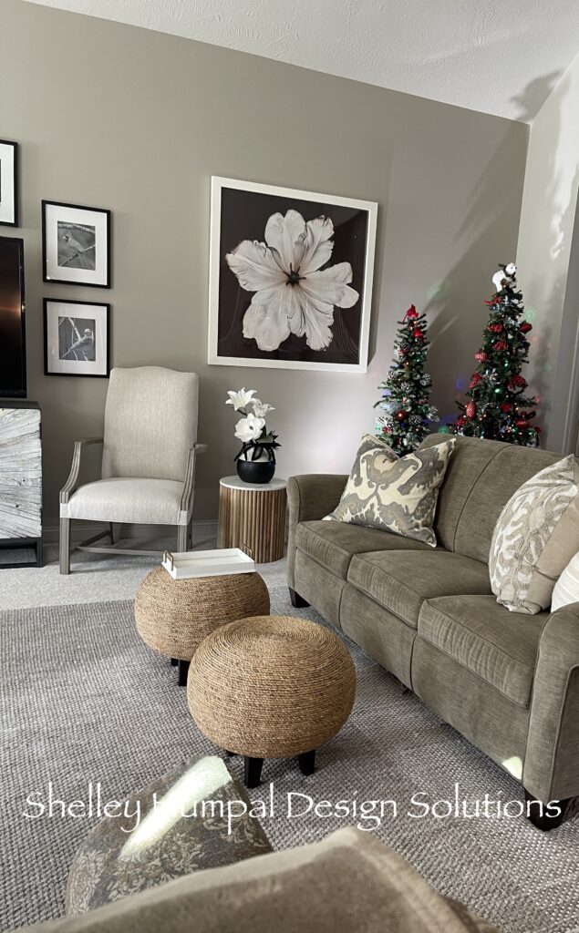
I knew we were going to need to work with the recliners, as they are comfortable and the homeowner really likes them. The lady of the house was not happy with the sofa. It was in perfect condition. The color was fine and the size couldn’t have been better. I convinced her we could make it work. Next, by moving the chairs and sofa, we were able to open up the room so you could see the fireplace upon entering. This no demo great room would be much more conducive to entertaining, as well. It was able to breathe.
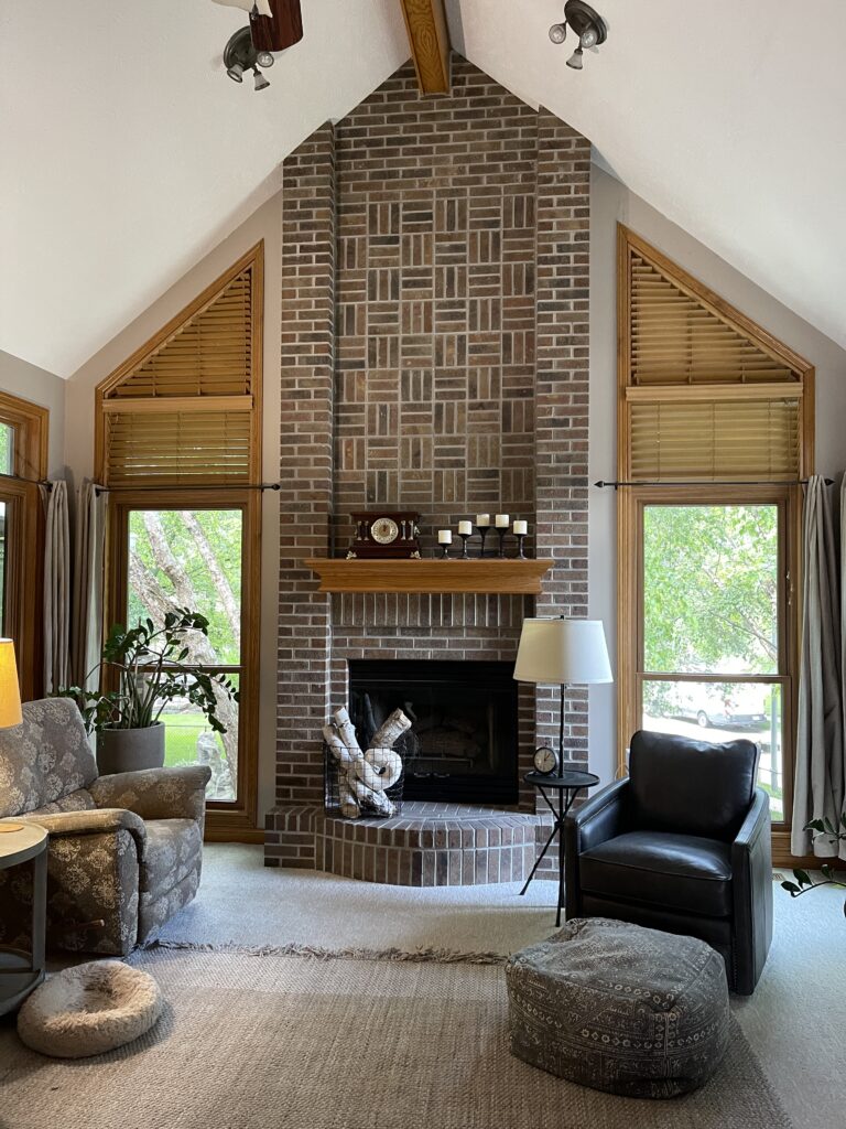
We did purchase a new leather chair for the corner in front of the window, and a round end table for between the two chairs. Then, we ordered two wicker poufs from Grandin Road to be used as tables in front of the sofa. A bakers rack that she had rounds out the corner where the TV used to be.
A Work in Progress
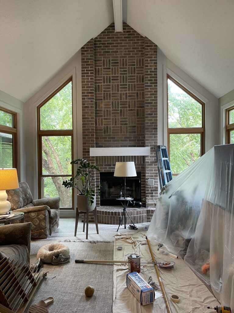
All of the walls, trim and ceiling were painted Benjamin Moore London Fog paint. I pretty much am an all or nothing kind of a girl. I generally don’t like accent walls. In this case because we did not have a “frame TV” I felt we needed a bit darker wall. The TV wall became Plymouth Rock. Both Benjamin Moore colors.
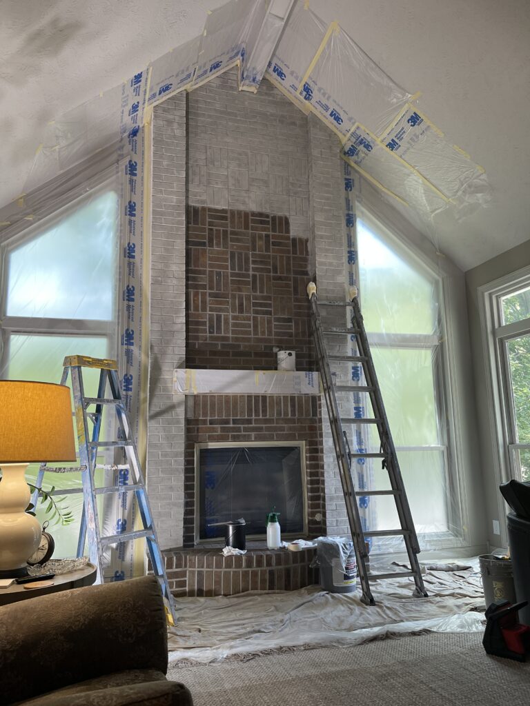
My client disliked the brick on the fireplace, so that was next. We hired our painter to do a Lyme Wash. I have not personally had the opportunity to do a Lyme Wash, so this was a first for me. You can work a Lyme Wash for up to 48 hours. The next morning my client was at the fireplace, with a rag and a scrubby, to remove just a bit of the wash. She wanted it just a bit scruffier and I think it turned out fantastic.
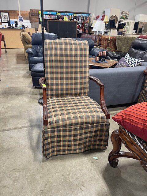
We had a lot of discussion about the chair to the right of the entertainment console. I knew exactly what chair we needed for this space. I wanted to find it pre-owned so I could save them some money. An impulsive trip to the Restore Store reaped gold. I found the chair. Looking a bit horrified, my client couldn’t see beyond the dark stains, horrible 1990’s fabric, and the skirt around the chair. The chair had bottomed out, too. This was so much fun for me! I pulled the skirt up exposing the legs and told her we could paint the frame. A piece of linen which I happened to have in my stash, and we would have a lovely chair. For $69.00, it was a good buy. She trusted my vision and bought the chair.

Piece by Piece
The homeowner stripped the fabric from the chair. The linen had been ok’d and a paint color was selected. We worked with Amy Howard One Step Chalk Paint, and I showed her how easy it was to use. First, we painted the frame gray with some clear wax, then added the antiquing wax on it. Afterwards, we headed off to the upholsterers, and in no time, we had a beautiful chair.
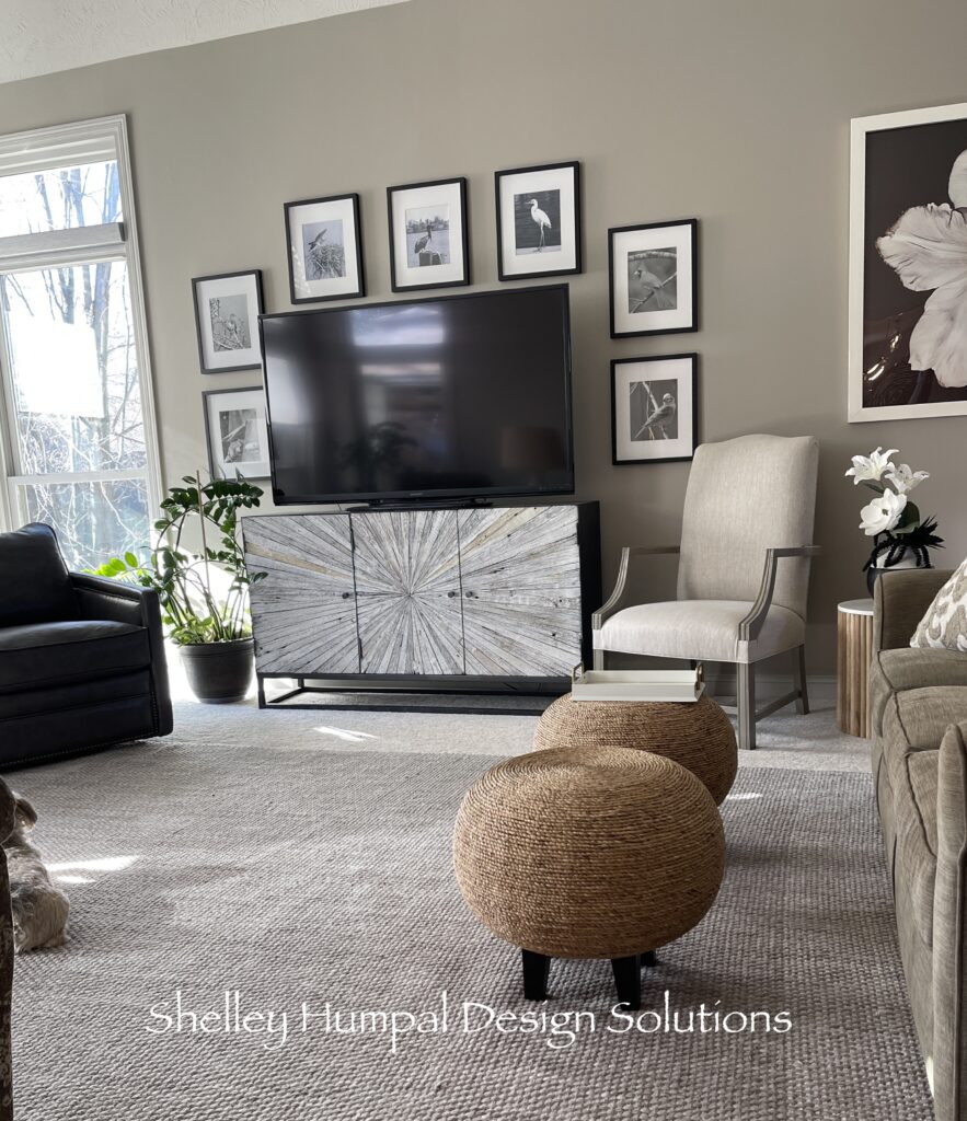
The lady of the house had a collection of bird photos, some which she took herself. They are all terrific. We used those pictures to frame out the TV with a large magnolia print she had to isolate the space to the right of the TV.

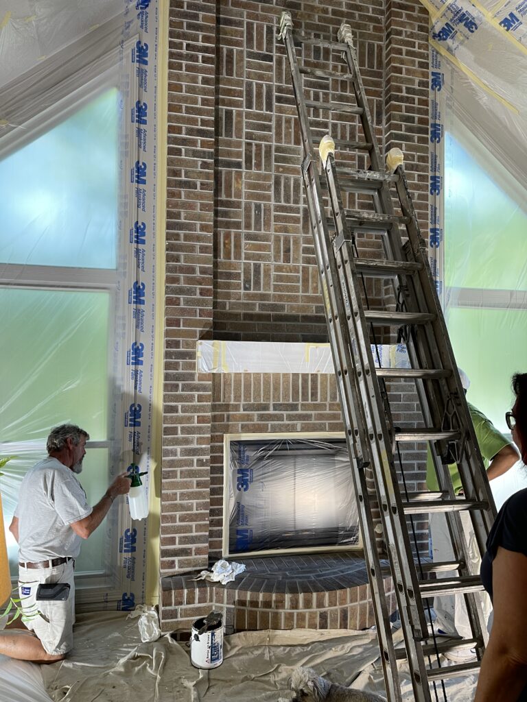
The homeowner made a simpler mantel. We painted it the same Dragons Breath to continue the accents from the kitchen. This helped set the stage for the area above the new mantel.
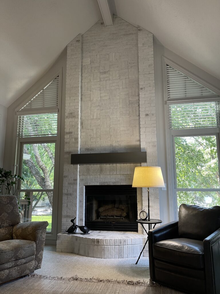
As the process continued, I could tell we needed something huge above the mantel. Wanting to introduce a bit of color into this completely neutral room. I went with her love of birds. An Audubon print would be unexpected and fun; we ordered a very large print and had it framed locally.
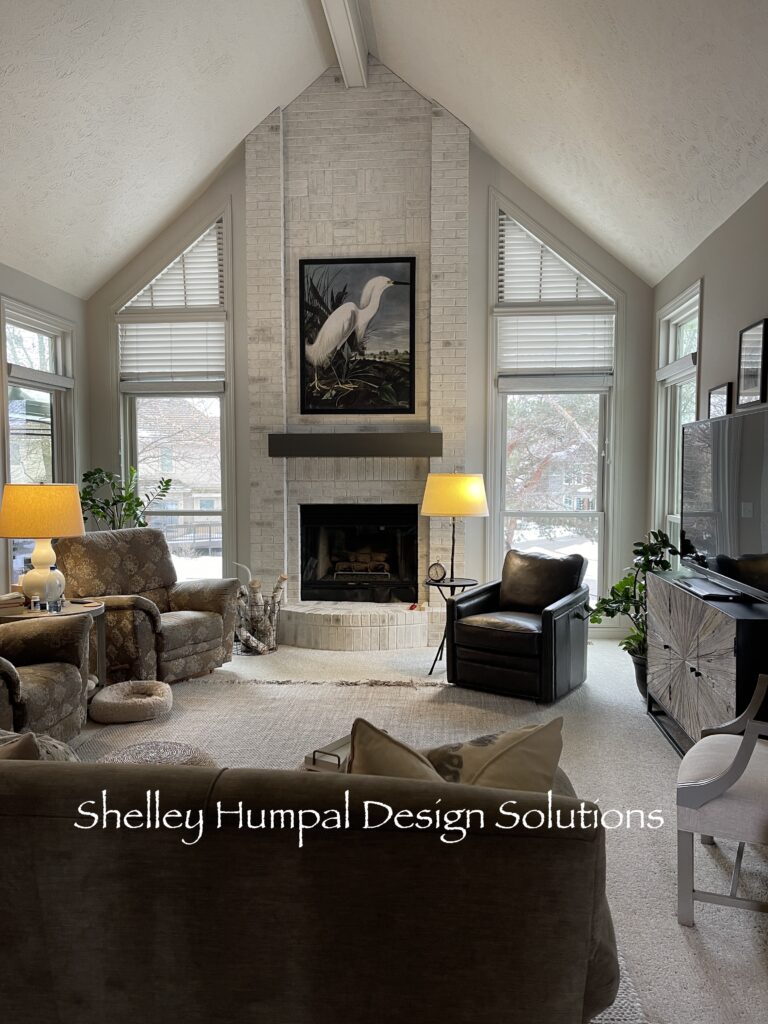
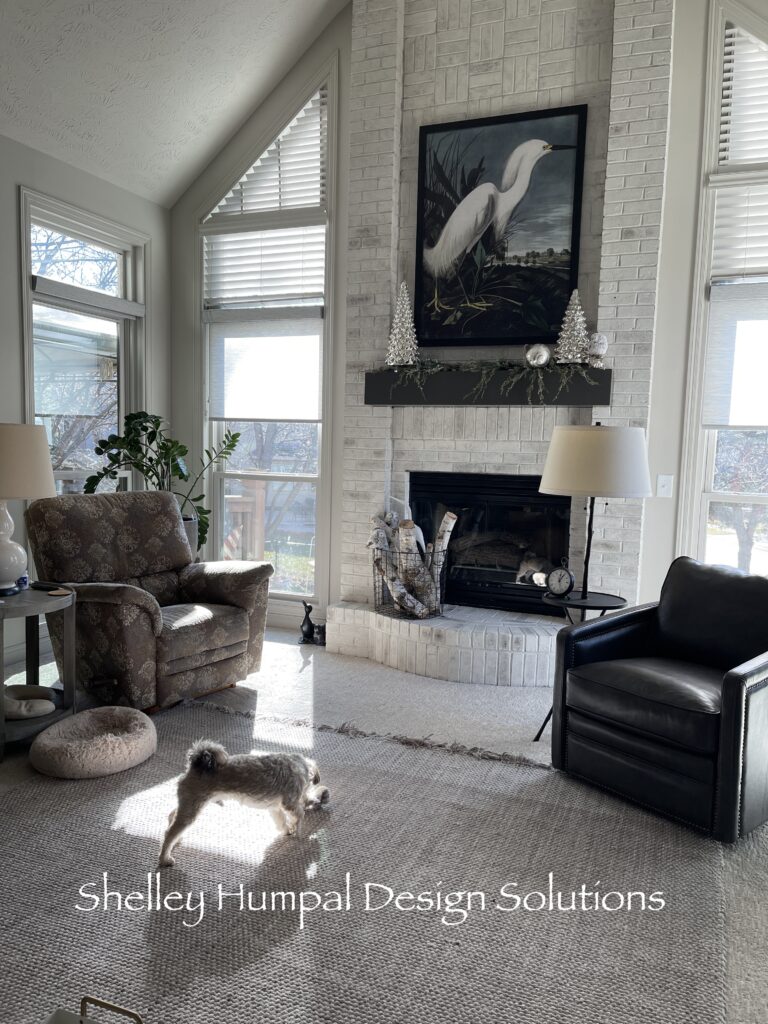
Upon entering the home for the first time after the print had arrived, I just gasped. It is sooo good. And this room is simple and gorgeous. We added some screen shades on the windows and called it good.
Bringing It All Together
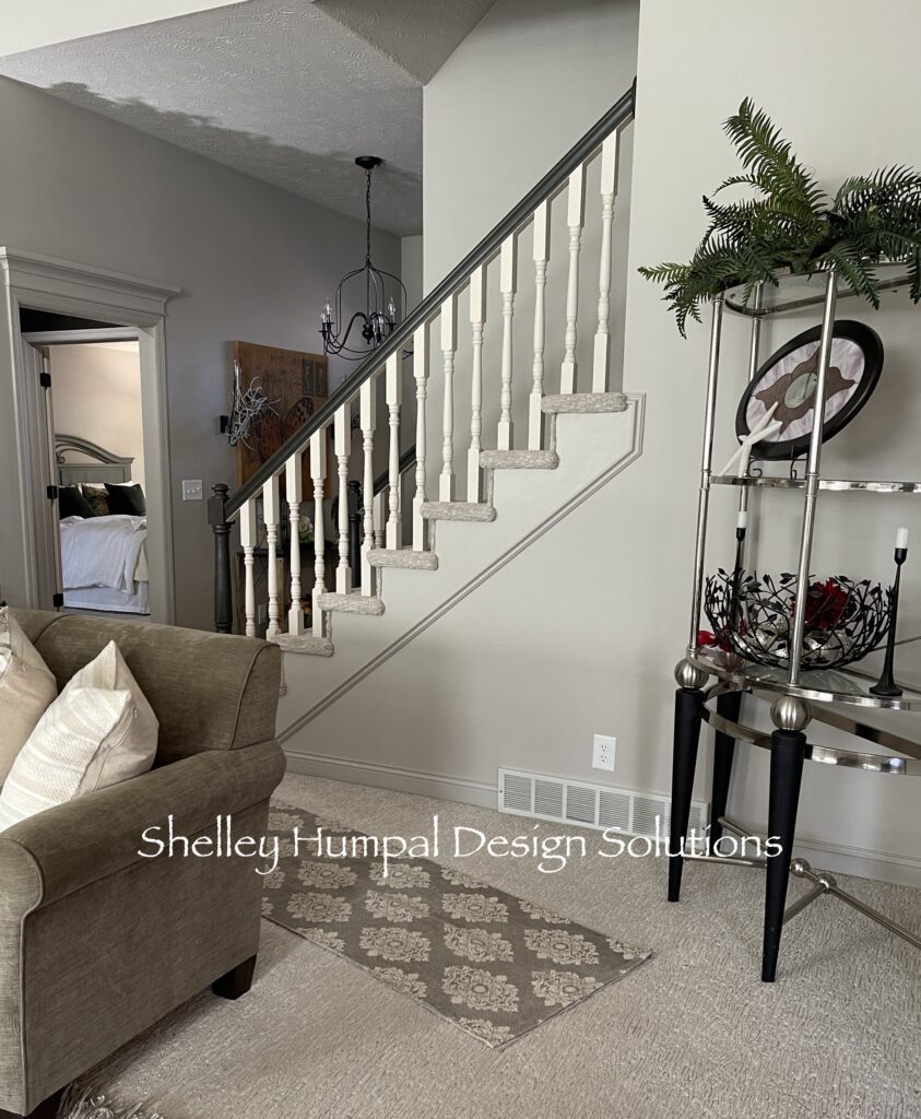
Though, we are still waiting on the chandelier, there wasn’t any high dollar, custom furniture ordered. No expensive art installations. All the high dollars were put into the renovation. Working with what we had, challenged us to make a gorgeous room. Picking and choosing where to spend and where to save. This beautifully demonstrates the power of maintaining an open mind. By keeping the ceiling and trim the same color, we created a serene and textured room, that reflects the elegance of the lady of the house and the homeowner’s remarkable talent. A perfect place for them to continue their new life together. A place to call home.
Let me know in comments what you think on my no demo great room. Could you do a completely neutral room or do you need more color?
Follow my No Demo Series below:
- 1992 No Demo Kitchen Renovation
- No Demo Great Room Reno/1992 Builder House
- No Demo Primary Bedroom/Bringing Miss Matched Furniture Together
Thanks for stopping
Shelley
Hello Shelley, I just recently found your blog, and I’m in heaven!! Your style is right up my alley and I am loving every minute of reading all of your posts—-including all your old posts starting in 2017. Is there a way to get the pictures back on your old posts? I would love to see them all. I am systematically working my way through all of your posts. You are so very talented! I found much inspiration from magazines back in the 70’s,80’s, 90’s—and even found my New England style saltbox house plans in an Early American Life magazine. My uncle built it for me in Tennessee, and I lived there for over 25 years. My husband and I sold it in 2013 and moved to Kansas City, Missouri, where we bought a 1929 Tudor, which I adored. But my furniture came with me! Then we decided to have a wild adventure, and sold that…in fact, we sold everything we owned except a few boxes of clothes and the dog….and moved to San Miguel de Allende, Mexico! We have lived there 7 1/2 years now and absolutely love it. Now I collect Mexican antique furniture, old talavera pottery, and antique Mexican religious art. I’m in love again with the whole process. Mexico is a colorful country and I have always loved color! We bought a modern condo, but the inside is all about our passions for collecting. I love your blog and will follow you from now on. If there is a way to see the pictures on your old posts, please let me know. Thanks so much. Pat
Hi Patricia: I am so glad you are enjoying my posts. That’s why I do what I do, and I am passionate about antiques and the story they can tell. I had to switch hosts last year and in doing so I lost images to the posts. I will go back and make an attempt to plug in but it will be a slow process because thousands of images were lost. Is there a particular post you are interested in? Maybe it would be easier to start there. Thank you so much for finding me and following along. I love the comments.
This is a crazy good transformation from where it started with so many disparate pieces and no focal point. Serene, inviting and sophisticated by comparison. I have tried unsuccessfully a couple of times to do a neutral space but I just don’t have the talent to get it right. It always falls flat and boring. I just lack the skills; plus my color loving heart can enjoy looking at or being in a well done neutral room but can’t actually live in one. I have too many lovely bits out and am too messy to pull off a room that needs to look polished. I do admire those who can. if you like cluttered collector and lots of color, I’m your girl. 😉 this was a great tutorial on how to pull together a neutral, somewhat contemporary space from the homeowners things. Thanks.
Pamela: Thanks so much for your thoughtful response. I too am a color girl but, it was fun going to the light side! I truly believe if you look for things that speak to you, you will find a way to make it work. If I can be of assistance to you please let me know. I am here to help.