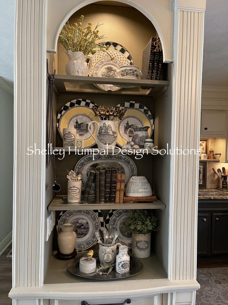
A couple of weeks ago while working at the Thrift Shop someone donated a 1969 House and Garden Magazine. I was asked if I wanted it. Heck YES! I immediately thought this would be fun research for a Blog post. Would the pages still be relevant after 55 years? Can they possibly relate to 2024?
So if you still read magazines, I would love to know how and what you read. How, meaning are you a cover to cover reader, a back to front reader, or a flip thru the page reader. I am a cover to cover reader, including the adds if they’re interesting. You can learn a lot from an add, like a countertop dishwasher for just 39.98!

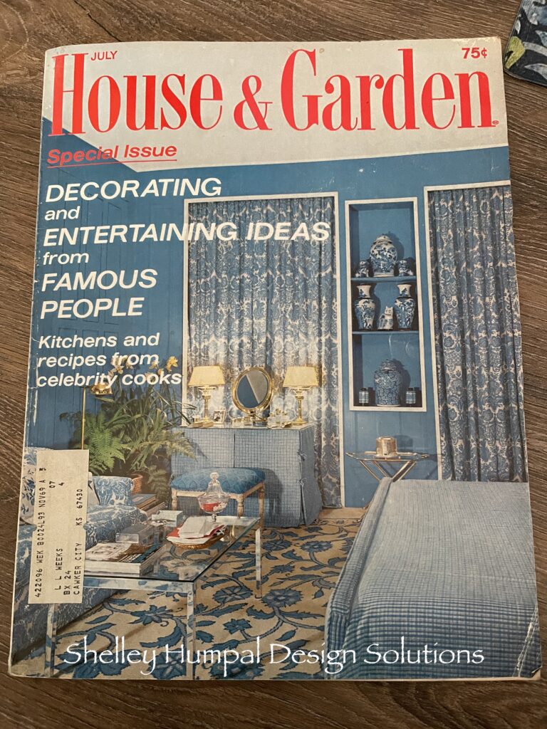
So for this exercise I started with the cover. The room featured the bedroom from Oscar de la Renta. His New York duplex was filled with beauty. What would be considered in 2024, Teal Blue paneled walls with niche’s, antique Chinese Porcelain, blue and white damask curtains, and check for the bedding and skirted vanity. A chrome and glass coffee table in front of the traditional damask covered sofa. The addition of an over scaled floral rug grounds the space. This is not my favorite shade of blue but it still holds true today.

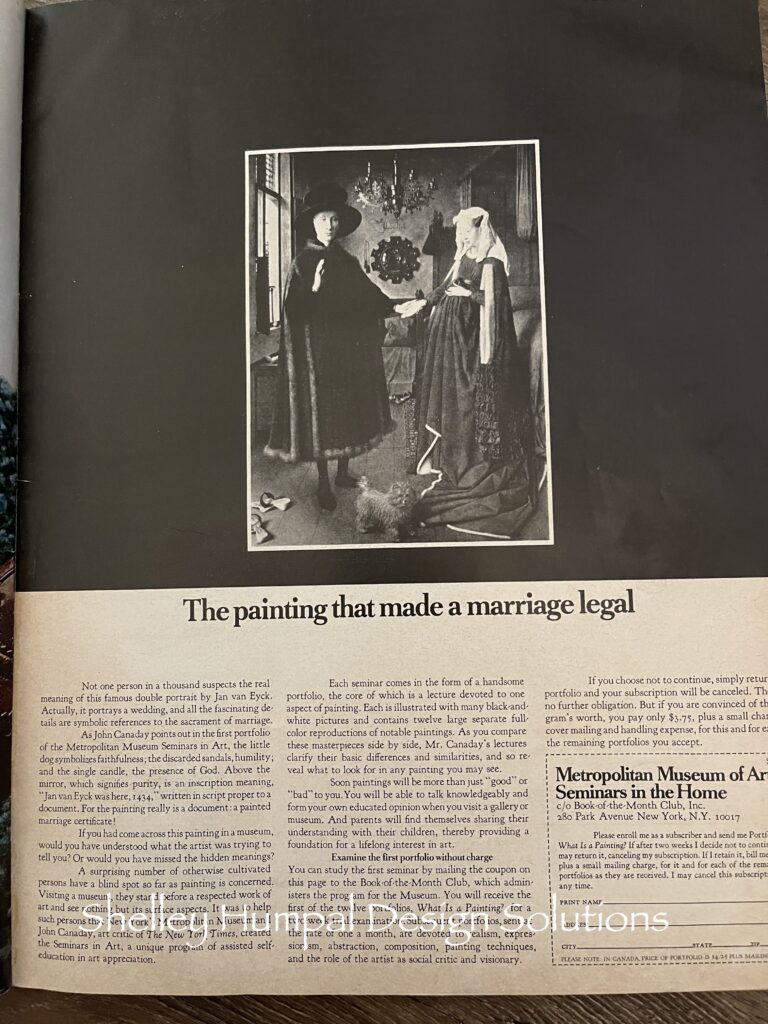
As I opened the first page I was immediately intrigued by an advertisement for the Metropolitan Museum of Art “Seminars for the Home”. The painting in the ad I’m sure you’re all familiar with. No, I have never seen it in person but I’ve seen it in pictures a million times. Jan Van Eyck double portrait. I remember in my Art History Class in college learning about the symbolism in almost every painting. This one is filled with them, the small dog symbolizes faithfulness, the discarded sandals, humility, single candle, represents the presence of God. Anyway, you could sign up for the course each featuring a different painting for $3.75 a month. Sounds like a bargain.
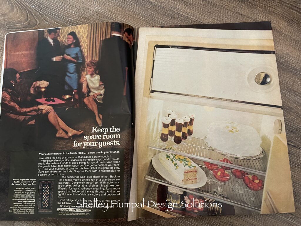
Keep the Spare Room for Your Guest! Put a new refrigerator in the kitchen and take the old one and use it in the Family Room. Really!!! OK my parents did this. We actually had a family room which was next to the kitchen and the Living Room. We didn’t have a refrigerator there! My mom would have died at this thought. They did take the old fridge down to the lower level room and put it in the laundry room. Came in handy for parties and stuff.
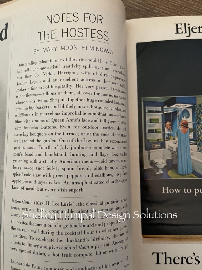
There was a couple of pages of Antiques: Questions and Answers. This was kind of fun. Then I turned the page and the next article was Notes for the Hostess. A who’s who of New York Society, from huge bouquets of flowers, to a chalkboard leaned against the terrace, written with the menu, miniature oil Lamps on the outdoor table, to opening up a small home and letting the guests wander with their plates and eat at will. The thing that cracked me up was the Mrs H. Lee Lurie. Always the husband’s name like women even in 1969 still had no identity. Yes I remember this.
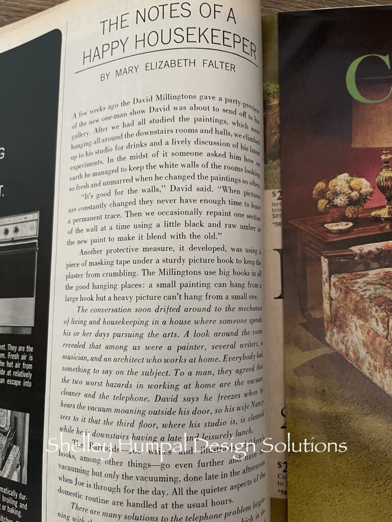
Then the mood changed to Notes of a Happy Housekeeper. The article was again about who’s who “The David Millingstons” as just one example of “Good Housekeeping”. The discussion was about a writer, an artist, a composer, and an architect who all worked out of the home. Sound familiar. The men were talking about the pit falls of working at home. The biggest complaint was the sounds the husbands had to endure, by the every day task of keeping a home. The noise the dreaded vacuum cleaner makes. The sounds of the telephone. Each man had a different routine while the “wives” learned to work around them. Vacuuming later in the afternoon, after he is done for the day or out for luncheon. I would probably vacuum when I please, and say put that in your pipe and smoke it!!! Oh I have done that.
Most of the magazine was still in black and white. Well, the pages have really yellowed! A section called Please Tell Me. Where is the annual craft show in Vermont, where do you send kitchen knives and scissors for sharpening. Where to go to get a monogram removed off of a piece of silver. Magazines back then were like Google. A source that would take you beyond your world. Take you beyond what you knew and what was familiar. A voyeuristic look into someone else’s life. Places to go and things to see.
Then the world seemed to change. Turn the page and you are now in “living color”. Oscar de la Renta again takes center stage. A Blue and white dining room consumed by a monochromatic color scheme and loads of pattern. The Mr and Mrs Oscar de la Renta’s New York duplex was a sanctuary from the canyons of the city streets. The dining room features a blue and white over scaled leopard print fabric on the ceiling, over scaled stylized damask on the wall, matching banquet with round covered table, a chrome bamboo console table, and bamboo chippendale style dining chair. A collection of antique Chinese porcelain that includes a pair of garden seats, lamps, platters, and vases. A Chinese Deer stands proudly in front of the window, the only relief from all the blue and white. I want to eat lunch in this room. Or dinner. I would even choke down a cup of tea, just for the experience. As good today as in 1969.
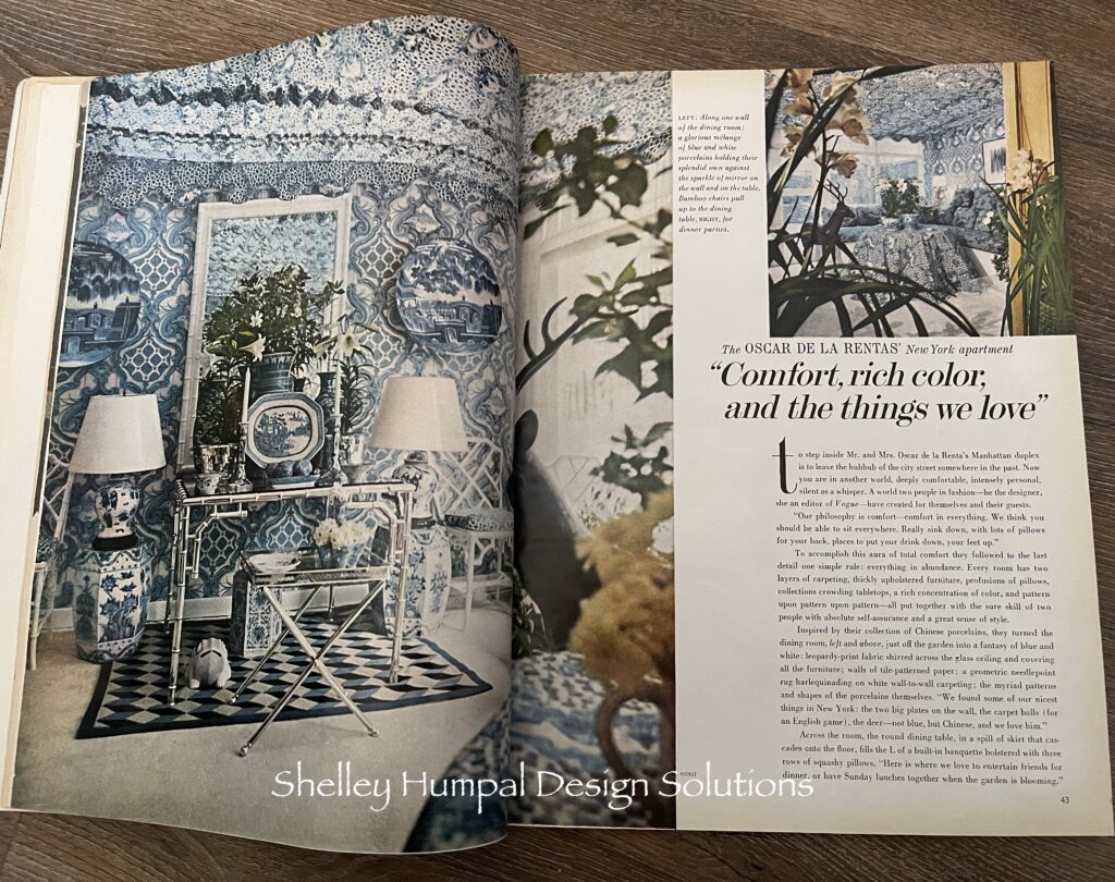
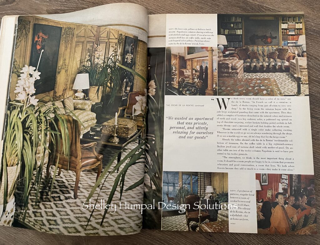
The following pages were filled with more of “The Oscar de la Renta’s duplex. Each room taking on a different color scheme and flavor. Long time collectors their home was filled with passion and pattern. Interesting color combinations, and a sense of a well loved home.
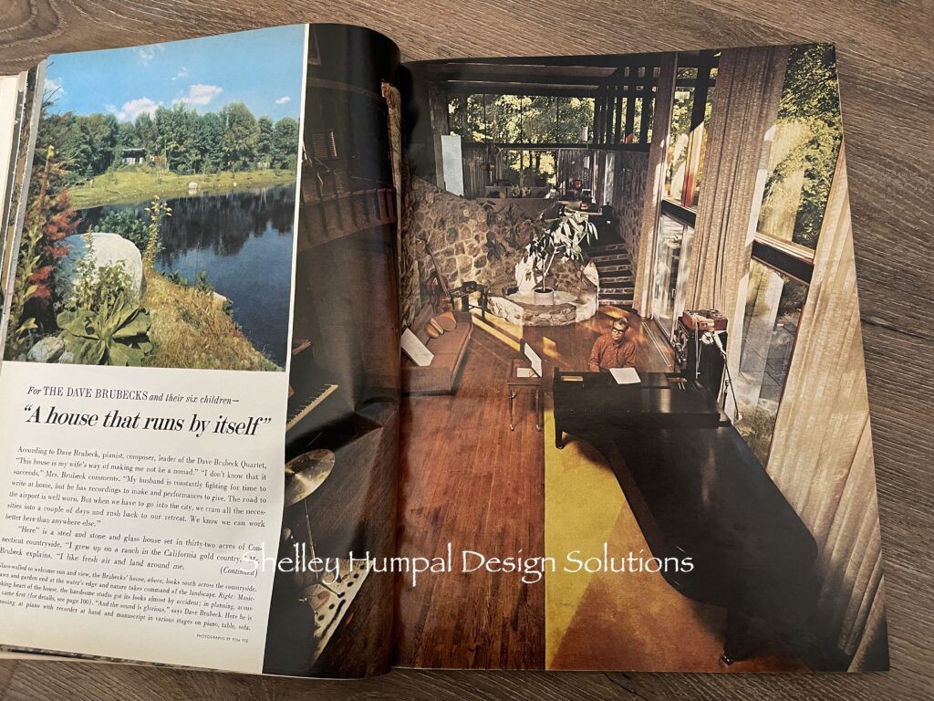
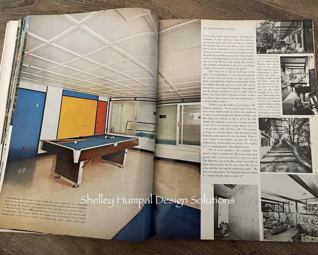
Moving on, more who’s who with a more modern twist. Artists, composers, fashion designers take “mid-century” and make it their own. From color blocking and hard geometric lines, (not my taste) to a stone, glass, and wood sanctuary on 32 acres in the Connecticut country side for this family of 8. A lovely mid century with many pianos, multi levels, and interior stone. Like many luxury homes built in the 60’s there is a stone planter that hosts a tree in this sun dappled music room. There is a wall of locker’s to corral all the kids stuff. Hmm, sound familiar.
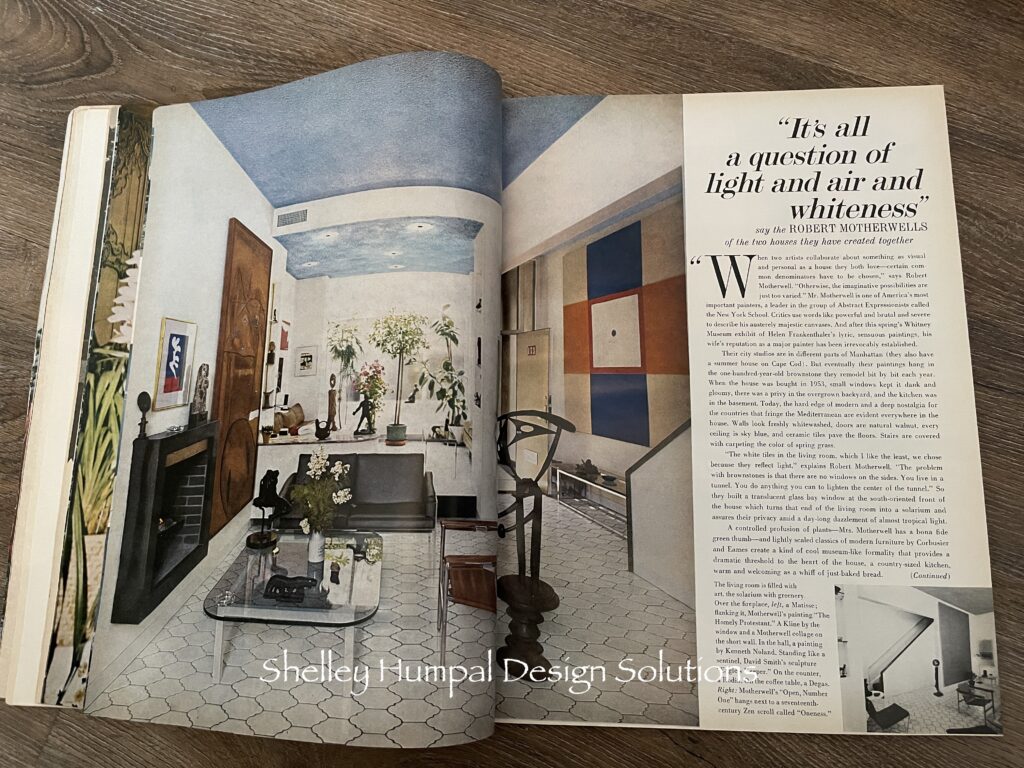
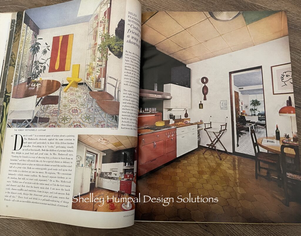
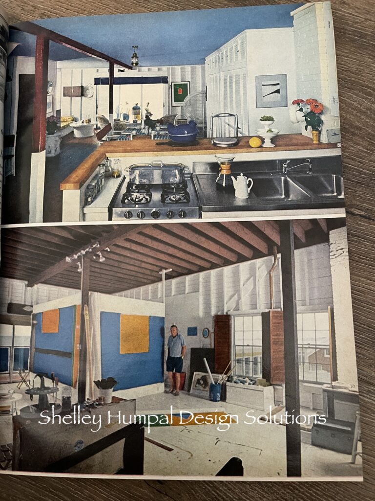
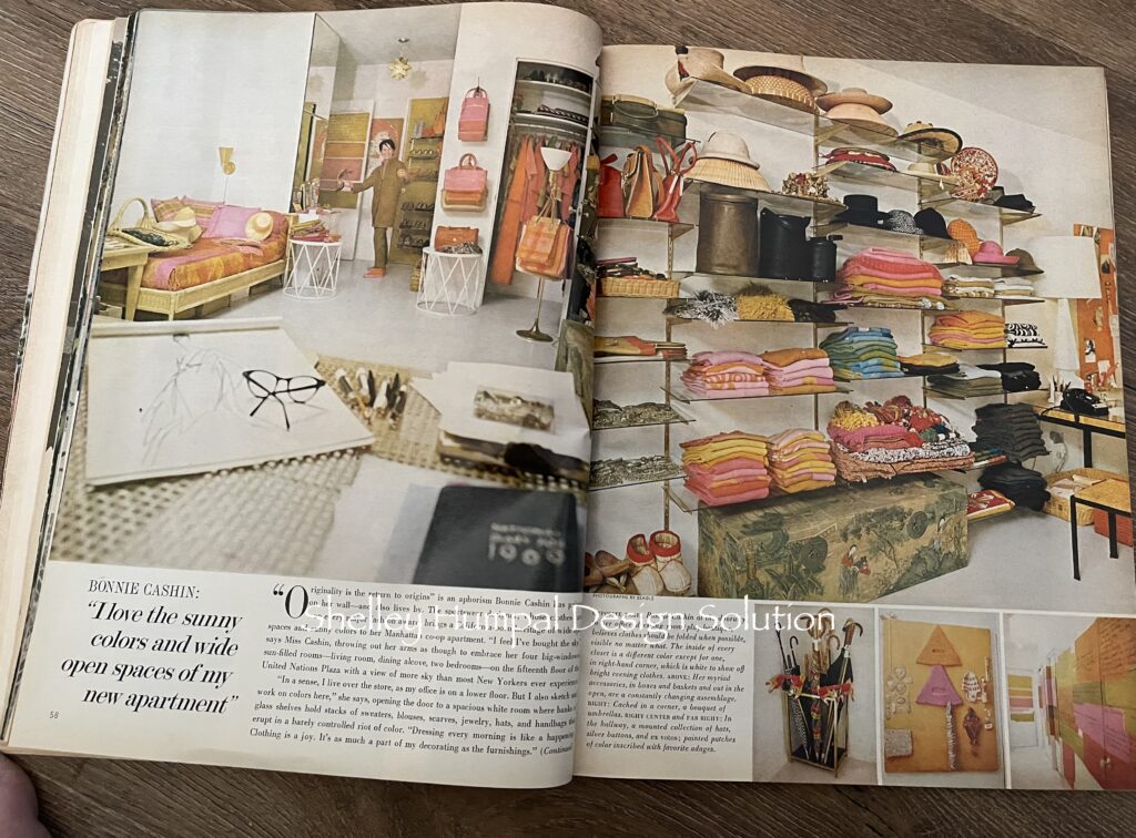
Sports wear designer Bonnie Cashin took a Manhattan co-op apartment and turned it into a sun filled colorful studio where she has glass shelves filled with sweaters blouses, bags, scarves. It looks like a luxury boutique or dare I say a closet for the well healed of 2024.
One thing all these people had in common, they were all collector’s. Curating their home as they went. Picking up objects in their travels or haunts. Things that remind them of place and time. I found this magazine research delightfully eye opening, and with most of the rooms, a few minor changes could bring these rooms into the 21st Century.
Think everything is new? Think again
Thanks for stopping
Shelley
